 “Based on the information we have collected so far, it appears that the government of Hawaii did not have reasonable safeguards or process controls in place to prevent the transmission of a false alert,” Federal Communications Commission Chairman Ajit Pai wrote in a statement after the incident. “Federal, state, and local officials throughout the country need to work together to identify any vulnerabilities to false alerts and do what’s necessary to fix them.” Whatever state and federal governments do to prevent false alarms from happening in the future (spoiler alert: the solution will likely be overcomplicated by layers of reporting and procedure), the situation could have been mitigated by better UX. Placing the “TEST ALERT” button right next to the “ALERT” button is similar in many ways to putting the “PUBLISH” button a few pixels away from “DELETE”: Sooner or later, someone is going to make a very costly mistake. For UX designers working on apps and websites, consider isolating your “mission critical” functions in a way that will reduce accidents; in the case of Hawaii, for example, a designer could have placed that “ALERT” in a completely separate menu from “TEST.” For extra safety, consider building a confirmation pop-up (i.e., “Do you really want to purchase this?” or “Do you really want to launch doomsday?”), which will further reduce the chance of accidental button-push. The Hawaii situation emphasizes how, although many companies consider design something of an afterthought, it’s absolutely vital. Early last year, an Adobe survey suggested that designers are in high demand, and that experience and portfolios are keys to landing a position; that situation hasn’t changed. Sometimes a good designer is the only thing standing between normal life and total chaos.
 When Good UX Means the Difference Between Safety and Disaster
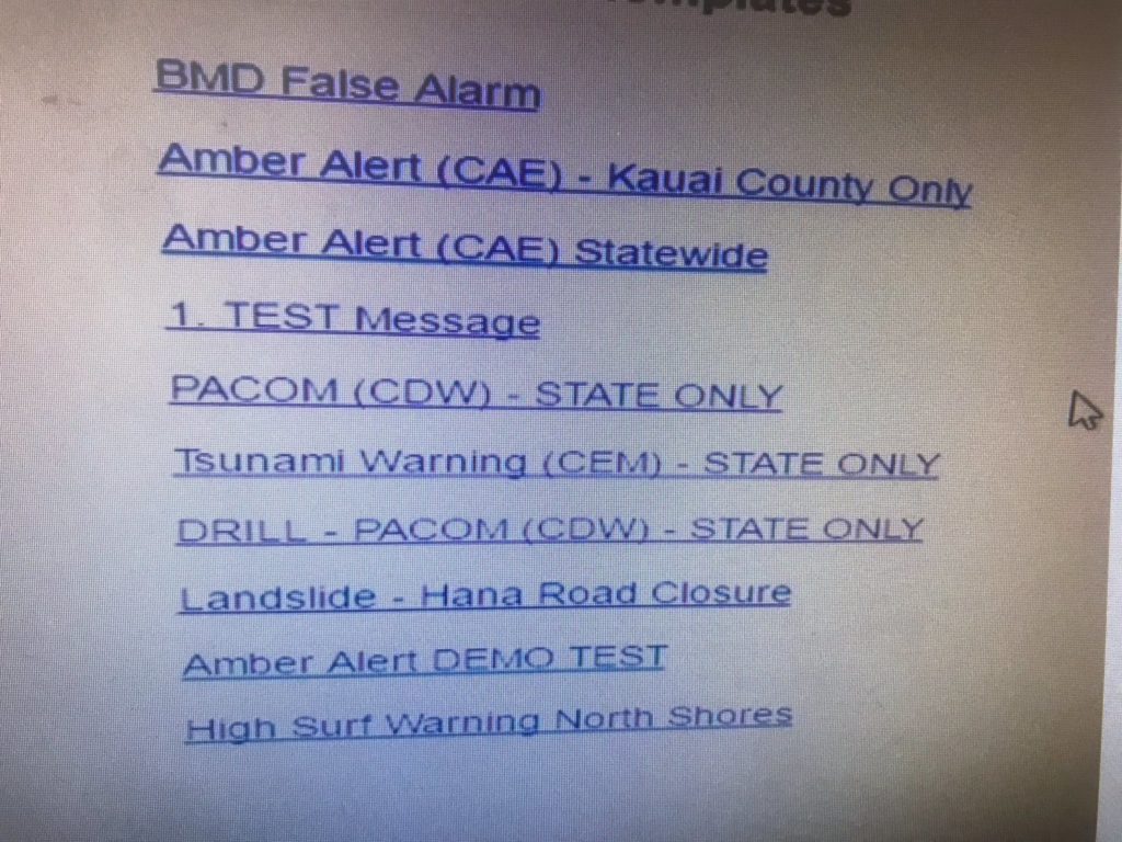
On January 13, the Hawaii Emergency Management Agency sent a smartphone alert to thousands of island residents and tourists: “BALLISTIC MISSILE THREAT INBOUND TO HAWAII. SEEK IMMEDIATE SHELTER. THIS IS NOT A DRILL.” Many people panicked, scrambling to take cover and phone family members. But thirty minutes after that terrifying message popped up, the agency sent a follow-up: false alarm. Hawaii Governor David Ige later said that the situation was due to an error “made during a standard procedure at the changeover of a shift and an employee pushed a wrong button.” In order to send an alert, an agency employee clicks on a drop-down menu with a number of options, including “TEST MESSAGE” (for testing alerts) and “PACOM (CDW) - STATE ONLY” (for sending alerts). The employee responsible for the mistake accidentally clicked the latter instead of the former. Take a look at the UX, courtesy of Honolulu Civil Beat's Twitter feed: “Based on the information we have collected so far, it appears that the government of Hawaii did not have reasonable safeguards or process controls in place to prevent the transmission of a false alert,” Federal Communications Commission Chairman Ajit Pai wrote in a statement after the incident. “Federal, state, and local officials throughout the country need to work together to identify any vulnerabilities to false alerts and do what’s necessary to fix them.” Whatever state and federal governments do to prevent false alarms from happening in the future (spoiler alert: the solution will likely be overcomplicated by layers of reporting and procedure), the situation could have been mitigated by better UX. Placing the “TEST ALERT” button right next to the “ALERT” button is similar in many ways to putting the “PUBLISH” button a few pixels away from “DELETE”: Sooner or later, someone is going to make a very costly mistake. For UX designers working on apps and websites, consider isolating your “mission critical” functions in a way that will reduce accidents; in the case of Hawaii, for example, a designer could have placed that “ALERT” in a completely separate menu from “TEST.” For extra safety, consider building a confirmation pop-up (i.e., “Do you really want to purchase this?” or “Do you really want to launch doomsday?”), which will further reduce the chance of accidental button-push. The Hawaii situation emphasizes how, although many companies consider design something of an afterthought, it’s absolutely vital. Early last year, an Adobe survey suggested that designers are in high demand, and that experience and portfolios are keys to landing a position; that situation hasn’t changed. Sometimes a good designer is the only thing standing between normal life and total chaos.
“Based on the information we have collected so far, it appears that the government of Hawaii did not have reasonable safeguards or process controls in place to prevent the transmission of a false alert,” Federal Communications Commission Chairman Ajit Pai wrote in a statement after the incident. “Federal, state, and local officials throughout the country need to work together to identify any vulnerabilities to false alerts and do what’s necessary to fix them.” Whatever state and federal governments do to prevent false alarms from happening in the future (spoiler alert: the solution will likely be overcomplicated by layers of reporting and procedure), the situation could have been mitigated by better UX. Placing the “TEST ALERT” button right next to the “ALERT” button is similar in many ways to putting the “PUBLISH” button a few pixels away from “DELETE”: Sooner or later, someone is going to make a very costly mistake. For UX designers working on apps and websites, consider isolating your “mission critical” functions in a way that will reduce accidents; in the case of Hawaii, for example, a designer could have placed that “ALERT” in a completely separate menu from “TEST.” For extra safety, consider building a confirmation pop-up (i.e., “Do you really want to purchase this?” or “Do you really want to launch doomsday?”), which will further reduce the chance of accidental button-push. The Hawaii situation emphasizes how, although many companies consider design something of an afterthought, it’s absolutely vital. Early last year, an Adobe survey suggested that designers are in high demand, and that experience and portfolios are keys to landing a position; that situation hasn’t changed. Sometimes a good designer is the only thing standing between normal life and total chaos.