Dice online visual style guide
An overview of Dice style guidelines that also includes examples, basic templates and documentation for use of the Twitter Bootstrap framework.

An overview of Dice style guidelines that also includes examples, basic templates and documentation for use of the Twitter Bootstrap framework.
This document defines the design vocabulary that communicates the Dice brand and delivers our UX.
The online treatment of our brand is included here but also all the common interactions between the user and the site so that our UX is consistent across every page. Consistency trains users to use our site more effectively every time they visit Dice.com, but also makes our design and development process more efficient.
This style guide is meant to inform the spirit, tone and sensibilities of all of Dice’s online communications while allowing our designers and developers to implement their own unique ideas for new features. Any new project could present an unforeseen element.
This document is intended to evolve constantly so your UI suggestions are important to its continued relevancy.
While the majority of this guide covers settings and documentation from the perspective of using Bootstrap, each section also includes details and examples in regards to style and UX. For example, if you wanted to find how to style form validation errors, you can find examples under CSS / Forms / Control states.
The Dice brand identity should communicate confidence while demonstrating a respect for its community's intelligence. Our aim for the UX is "frictionless", a UI that guides the user without distracting them. It should lure people in with a casual grace, rather than scream to get attention. Classy, not splashy. At the same time, we want the site to invite engagement from our users, both with our brand and our functionality, and communicate respect for users' expertise, which (particularly on the Tech Professionals side) often corresponds to our own. In this sense, Dice Tech Professionals are our peers and we should always be trying to win the respect of those peers.

The full color gradient:

The solid color logo is:

The grayscale gradient:
Pretty much black.
With some white.
Give the mark ample room when locking up with other elements.
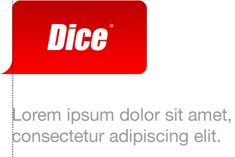
Align nearby elements below the mark with its left boundary.
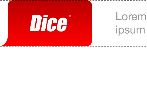
Center nearby elements set to the right of the mark vertically.
Do not indent alignment of nearby elements within the mark.
Do not colorize, texture or apply filters to the mark.
Use an understated tone with type placement. Use only minimal title-case and subtle punctuation:
Page section headers use standard headline capitalization rules, but subheads below use minimal title-case.
Connect with this new feature on Dice
Avoid overstatement, excessive enthusiasm, bolded words, or exclamation points in order to retain a more casual and genuine brand voice:

Avoid using ALL CAPS, heavy condensed and/or italicized type settings:


In keeping with the tech-centric identity of Dice, colors are web-safe and can be represented in hex shorthand (it's amazing how much more efficient code can be when using “#C00” for red instead of the full 6 hex characters). The Dice palette is built in color harmony from the base Dice logo red. The core colors of the Dice site are:
A bright, punchy range of contemporary supporting colors in a palette built to exist in harmony with the Dice logo red. Colors can be applied as flat solids or as subtle gradients, depending on application. Gradients should be built using 2 colors of similar hue. For best results stick within a single vertical column of the swatches seen below.
Fonts need to stick as closely as possible to base web standards in order to keep Dice consistently light, fast, clean and readable across all platforms. The main font stack for everything from headings to standard text is Helvetica Neue, degrading as “Helvetica Neue”, Helvetica, Arial, sans-serif.
The largest site content headings use a regular font weight in a hex color of #555555. Large headings over the light gray standard background should have a white 1px font shadow to the bottom and right.
Smaller headings use a bold font weight in a hex color of #555555. Smaller headings over the light gray standard background should have a white 1px font shadow to the bottom and right.
The default for body copy is 14px with a line height of 1.5 in hex color #333333. The standard font stack is also fine for print, but a serif font stack may be used for a print media query for copy-heavy pages primarily intended for print: Georgia, “Times New Roman”, Times, serif.
Keep it large, simple and clean. Give type ample whitespace and leading to provide additional clarity. Type should remain within a comfortably readable range of minimum and maximum characters per line. Try to avoid line-breaks that result in a single word on the following line of text.
Think "page flow", not "visual whack-a-mole". Try to keep the space that separates content groups wider than spacing between the items within each respective content group. Avoid defining every content group or section with boxes and borders to maintain flow within a clean layout.
The default state appearance of links on Dice is non-underlined with blue hex color code #006699. Link visited state is a non-underlined violet hex color #9999CC, and the hover state is underlined with a bright blue #66CCFF. The exception to this rule is with headlines as seen on ones in stories on the Dice Blog Network. These may maintain standard headline styling since their primary role is that of a headline.
Adobe Illustrator and Photoshop templates to get you started. These templates include layers showing grid basics, column layout examples, typography examples, color examples and graphic assets. Templates also include Dice headers and footers for multiple screen widths and devices.