Technology changes at lightning speed, and it’s imperative that the workforce echoes that pace. Ensuring the workforce has the skills to meet the demands of modern-day work is a matter that is only increasing in urgency. With the rise and adoption of automation and artificial intelligence, it’s estimated that up to fourteen percent of the global workforce – as many as 375 million workers – will need to switch jobs or acquire new skills by 2030.
And while the pressure builds to prepare our workforce for the future, we can’t forget that addressing skill gaps in today’s workforce is a critical issue, particularly as layoffs increase and hiring slows. Results of a McKinsey Global Survey revealed that 87 percent of executives said they are experiencing skill gaps in the workforce right now or expect them within a few short years—and less than half of the leaders surveyed knew how they were going to address this problem.
The far-reaching impact of this issue cannot be overstated. A recent report from the World Economic Forum (WEF) shared, “Human capital is a crucial asset of any business—in fact, in an age of ubiquitous technology, it is human skills, creativity and capability that will form the competitive edge for any organization. Financing and implementing a reskilling revolution must thus be viewed as a critical investment for business, workers and economies alike.”
Critical to Reskilling Effectively: High-Quality Assessments
As business leaders begin to build out reskilling programs within their organizations, they will be most successful if they start from a data-informed, unbiased assessment of where their workforce stands. Without that, leaders are making blind investments on learning and development programs that may not adequately address skills gaps or the needs of the organization.
The data derived from implementing quality skills assessments within reskilling efforts can help leaders build a strategy that can make the most of the talent already in place.
Not sold yet? Below are seven steps to implement a reskilling initiative.
Identify the Critical Technical Skills Your Future-Ready Workforce Needs
Through collaboration with job experts, workforce reviews, environmental scanning, and monitoring of industry trends and forecasts, identify the tech skills that are most likely to be essential for addressing emergent and future challenges and business needs. This means going deeper on strategic workforce planning. You need a detailed view not only of the core activities that mission-critical roles will begin undertaking but also of which skills these groups will need. Map out which skill pools will disproportionately impact your future business model and drive progress.
Identify Career Paths That Would be Unlocked Given Reskilling
Mapping how skills overlap and are distinct across roles in the organization can reveal an interesting web of interrelated roles that might not have been readily apparent. What are the paths of least resistance into mission-critical roles? That is, could a minor lift in reskilling unlock new and different internal talent pipelines for these key roles? How can building new or deeper skills change what options are available to your employees? Which skills should be developed to unlock the greatest number of paths into mission-critical roles?
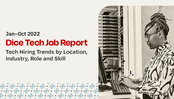
Find out which industries currently have the highest demand for tech professionals like you in Dice's latest Tech Job Report.
Establish a Baseline
By building and administering assessments of the skills you’ve identified as being essential for mobilization and future-proofing your workforce, you’re able to understand your workforce’s current skills and build a repository of data and skill profiles to use as a benchmark for designing and, later, evaluating the success of mobilization efforts.
Don’t Neglect Your Non-Tech Talent Pipeline
Regardless of roles, it’s essential to evaluate test-takers’ ability to grasp the types of topics and concepts that are essential for effective performance in roles such as software development and cybersecurity. Measuring things like technical aptitude, learning readiness, and trainability can help you discover hidden reservoirs of tech potential among your non-tech workforce.
Identify and Prioritize Gaps
Evaluate the extent to which the critical technical skills your future-ready workforce needs are reflected in the current skill profiles of your tech and non-tech workforce. Consider which roles will be most central to operational resilience and organizational performance over time, and prioritize addressing skill gaps affecting these roles first.
Mobilize!
Invest in tailored reskilling journeys to close critical skill gaps. Reskill employees to activate career paths of least resistance into mission-critical roles. These initiatives can take many forms: formal training programs, job shadowing, mentoring, coaching, self-guided study, etc.
Reassess, Repeat
After reskilling initiatives, re-evaluate your talent using assessments to gauge learning and development of particular skills. Update your skill profiles and data repository to evaluate progress from baseline. Which initiatives were successful? Which fell short? Which gaps were bridged? Which were widened? Then, considering this information, iterate and repeat this process.
An Agile Workforce is the Future
Talent mobilization isn’t a one-time task. It is an evergreen strategy for responding to industry changes and disruption in real time. Situating mobilization efforts within a culture of learning and continuous self-improvement will help ensure these efforts are successful. Organizations shouldn’t launch talent mobilization and then disband it after a crisis passes; it should be used to expand and enhance your mobilization capabilities going forward.
As organizations continue to feel the reverberating impact of the Great Resignation and a recession looms, losing talent is painful and expensive. More importantly, losing talent and not offering opportunities for reskilling seriously undermines the future success of the organization. In response, meet technical workers where they are, leverage the talent you already have, utilize high-quality assessments to identify opportunities for L&D, and ensure you are prepared to meet the workforce demands of the future.
Taylor Sullivan, Ph.D, is Senior Staff I-O Psychologist at Codility.